
Website Basics: What Your Homepage Must Say (So People Actually Enquire)
Does your website actually generate leads, or is it just sitting there looking pretty?
At Vinegar Creative, we design sites that look fantastic—but more importantly, we design sites that work. Because the truth is, your website has one job: help the right person take the next step.
If visitors land on your homepage and can't instantly figure out if they are in the right place, they will leave. It’s that simple. When it comes to web design, there is one golden rule you need to live by: Clarity wins.
Here is exactly what your homepage must say - and how it should be structured - so that people stop bouncing and start enquiring.
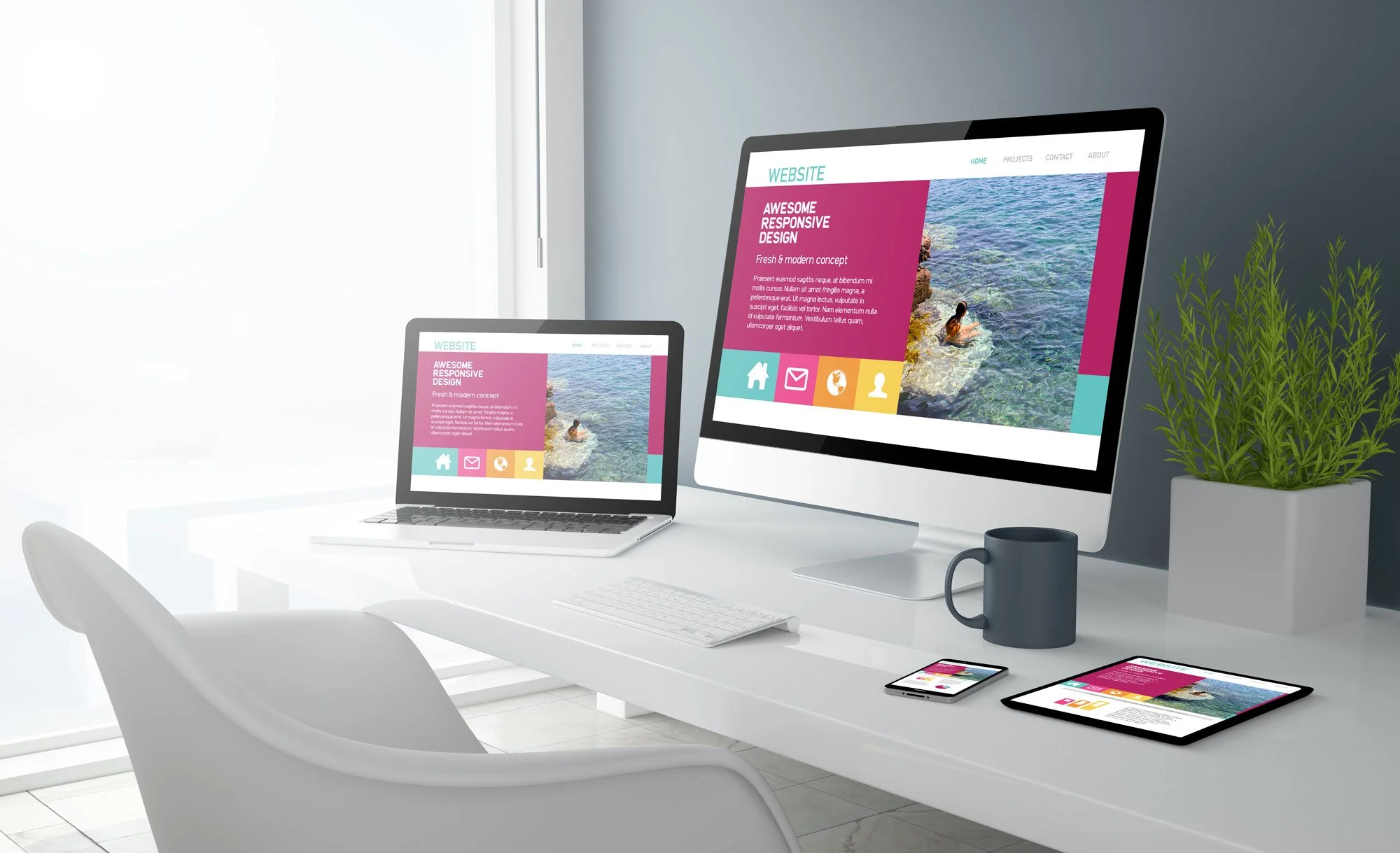
The Homepage Essentials
To convert visitors into clients, your homepage structure needs to hit four fundamental pillars: Clarity, Proof, CTA (Call to Action), and Navigation.
Before a user scrolls, your homepage must answer:
What you do: No jargon, just plain English.
Who it’s for: Call out your ideal audience so they know they’re in the right place.
Proof: Show them you actually deliver results.
Clear CTA: Tell them exactly what to do next.

The Simple Wireframe Outline
You don’t need to reinvent the wheel. The best, highest-converting homepages usually follow a very similar, proven wireframe:
1. The Hero Section (Above the fold): This is what people see before they scroll. You need a clear, punchy headline (what you do), a sub-headline (who it's for and the benefit), and a brightly coloured CTA button (e.g., "Get in Touch" or "View Our Work").
2. The Trust Bar: Immediately below the hero section, drop in some logos of brands you’ve worked with, or a high-star review badge.
3. The Problem & Solution: Agitate the pain point your customer is facing, and clearly position your services as the solution.
4. Services / How it Works: A scannable 3-step process or a clear breakdown of your core services. Use icons and short paragraphs. Keep it sharp.
5. Deep Social Proof: Give them a standout testimonial, a mini case study, or a video that proves your value.
6. The Final CTA: Don't make them scroll all the way back to the top. Give them one massive, clear next step at the bottom of the page.
7. Clean Navigation & Footer: Keep the top menu simple (don't overwhelm them with 20 drop-down links). Save the boring legal links and massive site maps for the footer.

Common Homepage Mistakes (Are You Making These?)
Being clever instead of clear: If your headline is "Empowering Synergistic Ecosystems," nobody knows what you do. Just say "We Build Standout Websites for Property Developers."
Hiding the CTA: Your "Contact Us" or "Get a Quote" button shouldn't blend in with your brand colours. It needs to contrast and pop.
Talking about yourself too much: Your homepage isn't really about you. It’s about your client's problems and how you solve them. Limit the "We have been established since 1995" talk.
Wall of text: People don't read websites; they scan them. Break up text with bold headings, bullet points, and great imagery.

The 15-Second Homepage Checklist
Open up your website right now and give it this rapid-fire test.
☐ Does the main headline say exactly what you do?
☐ Is it obvious who your ideal client is?
☐ Is there a clear, unmissable Call to Action (CTA) button visible without scrolling?
☐ Do you have visible social proof (reviews, case studies, or client logos)?
☐ Is the top navigation clean and easy to use?
If you answered "no" to any of those, you are likely leaving money on the table.
Is your website working hard enough? At Vinegar Creative, we like to keep things sharp for our clients. If your homepage isn't generating the enquiries you deserve, let's fix it. Get a professional review, actionable tips, and an SEO health check from our expert team for only £198 + VAT.