Brand Guidelines People Actually Use (Not a PDF That Dies)
Most brand guidelines start with good intentions.
A designer builds a beautiful PDF. The leadership team approves it. Everyone feels organised for about a week.
Then real life kicks in.
A new supplier needs a logo. A partner wants to co-brand a deck. Someone in sales makes a last-minute flyer. A junior marketer is asked to “just post something” on LinkedIn. The PDF is nowhere to be found, or worse, it’s found and ignored because it’s too long, too rigid, or too hard to apply.
That’s how brands drift.
At Vinegar Creative, we believe guidelines should speed teams up, not slow them down. The best brand guidelines are lightweight, practical, and built for multi-stakeholder teams, suppliers, and partners who need to move fast.
Why most brand guidelines die
A brand guide fails when it’s designed for perfection, not for people.
Common reasons:
It’s written like a design thesis, not a working tool
It’s too long (or too vague)
It lives in someone’s inbox, not where work happens
It doesn’t include real examples teams can copy
It doesn’t cover the messy stuff: co-branding, social templates, presentations, signage, email signatures
It’s not updated, so people stop trusting it
The result is predictable: everyone improvises, and your brand becomes inconsistent across channels.
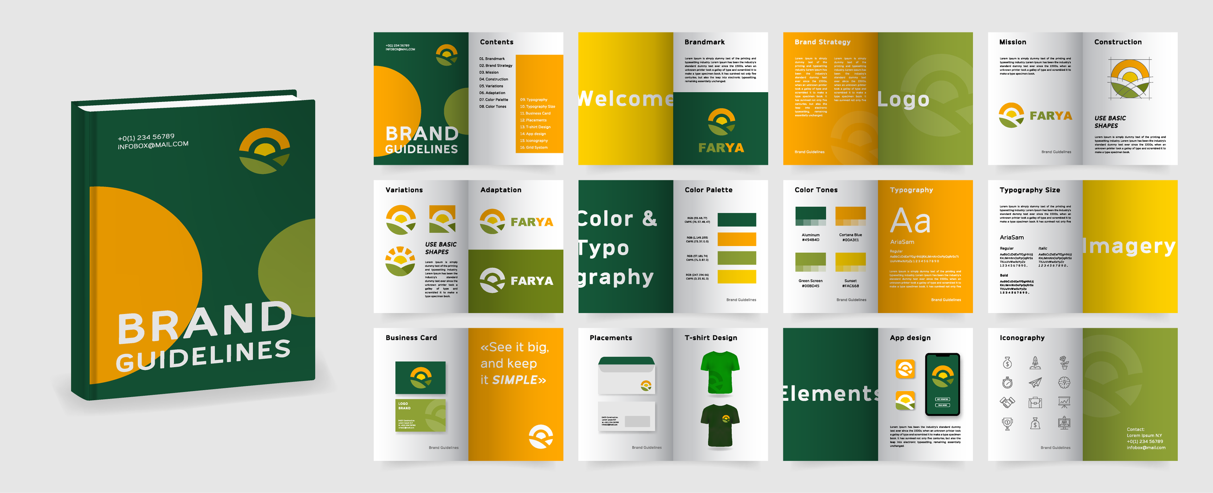
What “usable” brand guidelines look like
Usable guidelines are not about controlling every pixel. They’re about making it easy for anyone touching your brand to do the right thing.
Here’s what we aim for.
1) Start with the decisions people actually need to make
Instead of leading with pages of brand philosophy, start with the questions your team asks every week:
Which logo version do I use here?
What’s the correct colour for backgrounds?
What font do I use in PowerPoint?
How do we write headlines?
What does a social post look like?
How do we handle partner logos?
If your guidelines answer these quickly, they get used.

2) Make it skimmable
Nobody wants to read a 60-page PDF under pressure.
A practical guide is:
Clear headings
Short sections
Visual examples
Simple do’s and don’ts
Copy-paste snippets (for messaging and tone)
Think: “I can find what I need in 30 seconds.”
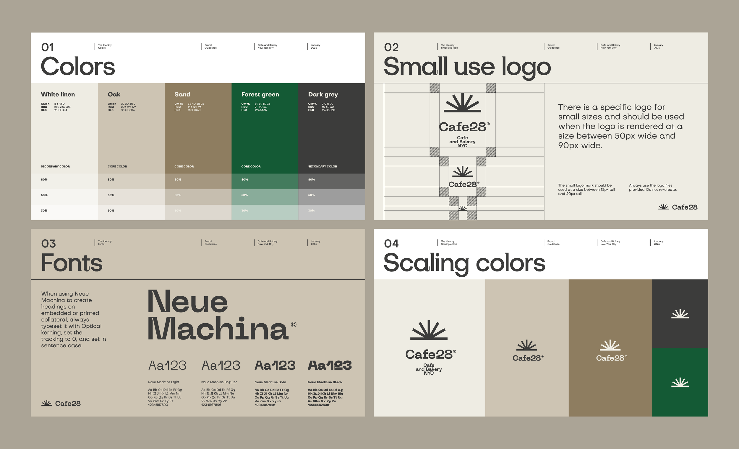
3) Build a small set of non-negotiables
Your brand doesn’t need 200 rules. It needs a handful of principles that protect consistency.
Examples of non-negotiables:
Logo clear space and minimum size
Colour hierarchy (primary, secondary, neutrals)
Typography rules for headings and body text
Image style (what we do, what we avoid)
Tone of voice pillars
When these are clear, everything else becomes easier.
4) Include templates people can actually use
Guidelines without templates are like a recipe without ingredients.
We often include ready-to-go templates for:
PowerPoint / Google Slides
Social posts (LinkedIn, Instagram)
One-page flyers
Case study layouts
Email signatures
Proposal and credentials documents
Templates reduce “creative guesswork” and keep quality high, even when different people are producing content.
5) Design for multi-stakeholder teams and partners
Most brands aren’t built by one person. They’re built by a network.
Your brand might be touched by:
Internal marketing
Sales teams
External designers
Web developers
PR agencies
Print suppliers
Event teams
Franchisees or regional partners
So your guidelines need a section that says:
Where assets live
Who approves what
What partners can and can’t change
How co-branding works (logo lockups, sizing, spacing)
This is where consistency is usually won or lost.
6) Put the guide where the work happens
A PDF on a desktop is not a system.
A brand kit should include:
A shared folder with the latest assets (logos, fonts, colour values)
A simple “start here” page
A version date so everyone knows what’s current
A quick checklist for new suppliers
If you want adoption, make access effortless.